Go back
Designing for a brand with a strong, unfiltered identity
Designed and launched the digital presence for Masterskaya, a creative hub founded by Ivan Dorn, translating a bold brand identity into an immersive website that connected emerging musicians with educational resources, events, and community.
Role
Product designer
Platform
Web Application
Industry
Music / Creative
Tags
Visual Design
Brand Identity
Marketing Site

Project Overview
Masterskaya is a creative space founded by Ivan Dorn with the purpose to provide essential resources and tools for young and distinctive musicians. Masterskaya consists of 2 parts:
- the House of Culture “Masterskaya” for booking recording studios and organizing music-related events;
- a music publisher itself that specializes in producing and distributing music.
For the 5th anniversary they wanted to launch a website to promote their services. Also they would like to clearly separate 2 parts of Masterskaya on the website, but to keep focus on the music publisher part.
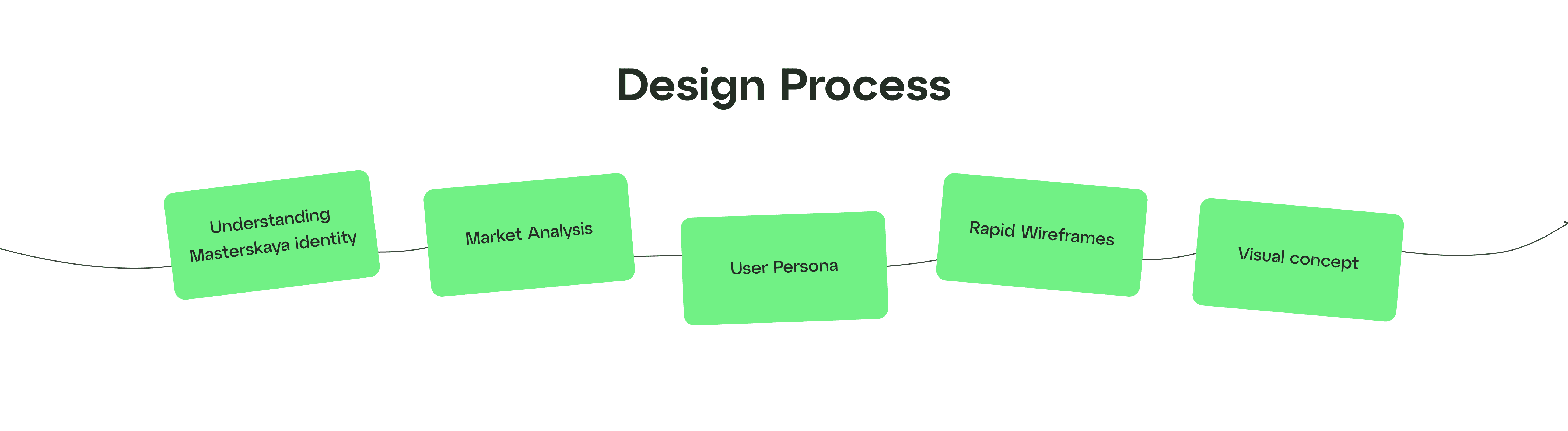
Understanding Masterskaya Identity
I began our initial research by getting familiar with Masterskaya identity and vision. They are very unique in everything they do, so understanding their lifestyle and their way of thinking was important.
After listening to the dozens of their songs, scrolling through their Instagram posts and learning about their artists, I created key words that associates with the brand:
- bright
- inclusive
- flexible
- sincere

Market Analysis
Then we started to dive into the music industry. We began looking at the famous recording music studios, music labels, artists’ personal websites to understand their structures and essential features.
Masterskaya has a unique structure and it certainly has a lot of services to provide. But still on this stage we managed to get the idea how it is done in other similar music-related websites, so we won’t invent a new bicycle.

User persona
To summarize our research findings, we together developed a User Persona to represent the target user we were designing for.

To summarize our research findings, we together developed a User Persona to represent the target user we were designing for.

UI Kit
Following the completion of the final design, I grouped all components into 1 unified file to ensure consistent styling across the entire project.
The font, provided by the client, exudes a unique identity, while the chosen bright green accent color adds vibrancy to the Masterskaya website. Opting for a single accent color aligns with the studio's colorful Instagram presence, directing attention to the captivating photos of the studio and the artists' works. Also, the images were formatted into polaroid photos, a decision behind it will be explained in the Unique Features section below.


Unique features
Voice of Tone
Friendly and sincere.
Loudness
On the 1st screen we have the title ‘Masterskaya’ with echo filter. It represents the loud music in the House of Culture where they organize music events or concerts.

Polaroid photos
The whole website is build using polaroid photos. When you hover on the card, it will side to the left as if you pull the polaroid photo.
It perfectly describes the artists in the way they want to be seen – unusual, sometimes weird, but interesting.
Polaroid cards alsobrings more comfort and nostalgia to the website, but still maintain its liveliness and originality.

Final solution


Conclusion
Although the project evolved beyond the original visual direction, it was a valuable exercise in balancing creative ambition with real-world constraints. The experience strengthened my ability to collaborate with stakeholders, navigate changing priorities, and deliver thoughtful design solutions under tight timelines.
Back to Top